Just how important are brand colors in the overall presence and blog/website making? What is the meaning of colors, how to pair them well and how to make a good brand color palette? These are just some of the topics we cover in this in-depth guide to help you understand, define and choose the perfect colors for you.
Did you know that the colors you choose can have a huge impact on your business? No matter what type of blog or business you’re planning on starting, colors can make or break the overall experience people have when interacting with you. Think of accessibility design of your site, as we explained in our recent post, let alone other aspects of UI.
Now, I’m no expert in the graphic nor web design, but I researched for many months about the color psychology and its effect to businesses, so.. Before I introduce you to the great free tools you can use to make a brand color palette, let’s dive in into the basics of the meaning of colors in the brand design, shall we?


Color meaning and symbolism
Every color speaks a different vibe and carries a different message. Some are bold and aggressive, some are passive and calm, others stable and secure. Knowing the story behind them can have a great impact on the brand strategy of your blog/site/business. That is to say, before you start creating your brand identity color palette, learn about the symbols each color delivers.
Red
Red is a symbol of anger, danger, love, passion, strength. It refers to something intense and because of it is used as a dominant color. It captures attention; it’s bold, eye-catching and energetic. Think of Coca Cola, CNN, YouTube, LEGO, Target… Or our Typology theme, for example 🙂
Yellow
The color of the Sun, joyful, happy, playful, intellectual and optimistic. Yellow is a symbol of hope, happiness, friendliness, and energy. At the same time, it’s a color that symbolizes caution and warning, so it’s used by the police, and other relatable hazardous situations. Think National Geographic, Nikon, IKEA, DHL, IMDb, Snapchat.
Orange
The color of energy, fascination, creativity, determination, success, stimulation. Orange refers to heat but without the aggressiveness of the color red. It’s often attached to the meaning of encouragement and enthusiasm freshness. Remember Fanta, Nickelodeon, Mozzila, Amazon perhaps? 🙂
Blue
The color blue is the symbol of trust, communication, stability, harmony, but at the same time is the symbol of depression. Still, it’s the most preferred color, and many brands and companies use it. Think of Facebook, Twitter, LinkedIn, IBM, Oreo, Dell, WordPress, and so so many others.
Green
Obviously, green is a symbol of nature and money, so it’s typical to see it around food-related businesses but not so much in finance. It refers to health, growth, harmony, safety, freshness, but also fertility. It’s the most soothing color for the human eye, and so many health-related brands use it. Think of Animal Planet, Android, Duolingo, Envato, Fiverr, Starbucks, Whole Foods,…
Purple
The color of royalty, elegance, sophistication, luxury and wealth. It’s a symbol of high power, ambition, and nobility; it’s a mysterious, dignified, imaginative and wise color. As such, brands like Yahoo, Hallmark, Barbie, Viber, FedEx, LA Lakers chose it as their go-to brand color. As did we, for our Opinion theme.
Now, these six are what are called primary and secondary colors. As in colors that can’t be made by mixing others: red, yellow and blue; and colors made by mixing others: orange, green and purple. Furthermore, we have neutral colors that include black, gray, as well as the earth tones such the ones from the brown color spectrum. And more:
Black
Black is the color of authority, elegance, and formality, style, but also sexuality, fear, mystery, evil and death. As such, companies like Apple, Adidas, Chanel, Disney, Louis Vuitton, Nike, chose it as a primary color. Talk about luxury, right? 🙂
White
White is the color of purity and innocence, cleanness and simplicity, as well as the symbol of new beginnings. Cotton, The Beatles, Nintendo, Uber, Tesla, chose it as their primary brand color so look up for some inspiration there if this is a color you want to go with.
Gray
As a color that is a mix of black and white, gray is associated with both conservatism and neutrality, elegance and formal symbolism. You may have seen this color with brands like Wikipedia, Nissan, Forbes, Mercedes Benz but also Swarovski and, again, WordPress!
Brown
The color brown is most usually associated with everything and anything organic related. It also symbolizes growth, stability and is seen as approachable and reliable color. Nespresso, M&M’s Hershey’s, UPS, J.P. Morgan are among the brands who recognize this color as a part of their brand color palette.
How to combine colors for your brand?
Now, knowing about the story behind each color isn’t enough to build your color palette. Apart from it, you’d need to understand how to combine several colors and make them compatible with what you want and need to achieve. And, let me tell you, it is a huge field to cover in just one article, so I’ll refer you to some relevant sources you can learn more from. And here, I will quickly go over the basics of proper color combining.
What I often advise people I work with is to not go overboard with colors. Too many of them and you’ll be out of focus, unprofessional and confusing for your audience. So, choose the one primary color and add two or three more, max. That way, you will build a solid, recognizable brand and won’t seem all over the place and distracting. So, those 3-4 colors can be your main, eye-catching color that is most usually a bold one, then a neutral base color and CTA one, to pop-up and help you deliver the message better. It’s all about the aesthetic and message you want to provide to your target audience. However, in some cases more color can be good, so choose yourselves what’s best for you.
So, we covered the basics, now on to the proper tools. What can you use to define your brand color palette?
12 brand color generator tools and how to use them
Adobe Color CC tool
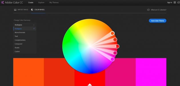
You may or may not remember it as Adobe Kuler, one of many useful Adobe’s free tools. Adobe Color CC helps you generate color schemes and palettes from scratch. No need to know that much about colors, just play around with options and choose the colors that best suit your needs. Play with the Color Harmony features or import an image you like and customize colors from there. Either way, once you’re finished, save the preferred color theme, and that’s that!
Color calculator
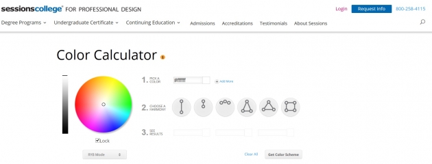
A great free tool offered by Sessions College, an online college that has a lot of more interesting things to share. It works similarly as Adobe Color, and you get the brand color palette in just three steps:
- Pick a color
- Choose a Harmony and
See the results!
You can play around with tones and different colors, maybe add more value or saturation. Either way, You’ll get a report of the hex, RGB, and CMYK color values for your project and see your colors applied to design samples.
ColorDrop
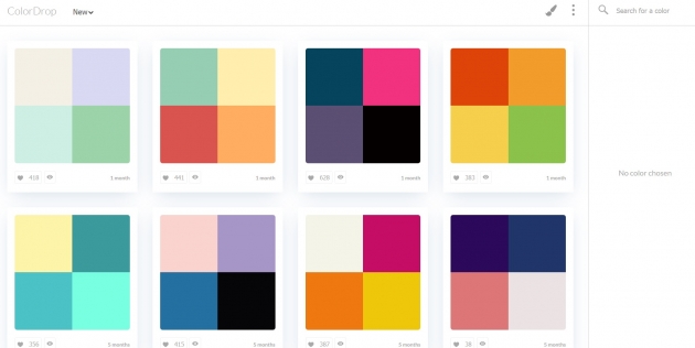
Another great free color generator tool that you can use with ease. Just click on the link and in the right sidebar type the preferred color, and you’ll get a wide range of color combinations to choose from. Pick and choose the ones you’re drawn to the most and start from there 🙂 Or, if you’re still not sure where to start from, choose among the New, Popular or Random category next to the logo.
Color Hexa
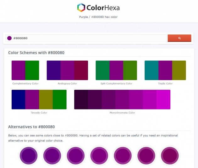
Pretty serious color scheme generator tool that not only helps you create brand color palette but educate you about it’s pairing shows you different shades and tones, as well as shows you how a specific color is perceived by people affected by a color vision deficiency. Something that is very important and is a part of accessible design tips we wrote about recently.
Color Hunt
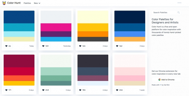
One of my personal favorites, even from before my business days. Color Hunt is a free tool for defining your perfect color palette as well as for inspiration with thousands of beautiful choices. Works in very similar ways as ColorDrop and has the same category choices + Trendy one. Guess I like the aesthetic of it all and the way the palettes are presented. Anyhow, this tool comes as Chrome extension as well, meaning you can get a new color palette inspiration every time you open a new tab! It replaces the empty tab with random beautiful color choices you can get inspired by. Seems nice, right?
Color Mind
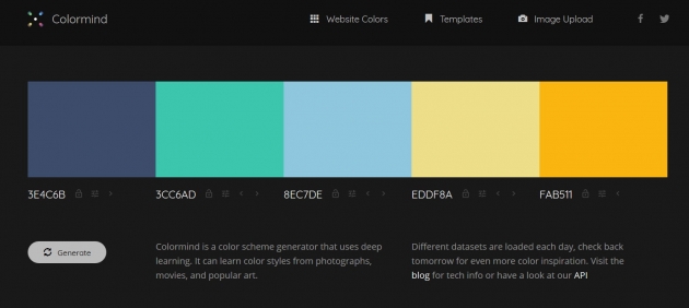
A color palette generator that you can use both automatically or by uploading a specific image you like. What I like here is that you can choose the Website Colors options and see in real time what would some random site look like with these color schemes. Furthermore, Template option gives you a sneak peek into things like:
- Dashboard
- User profile
- Table list
- Typography
- Icons
- Maps
- Notification
Really great freemium tool with some amazing free features. Premium version of a Bootstrap 4 Pro kit is $79.
Coolors
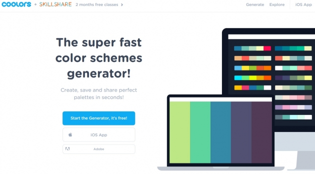
Great little color generator tool that you can get on the go as well. Apart from its website features, Coolors is available as iOS and Android app as well as in Adobe add-on and it’s free to use. How does it work? Simply click on the Start the Generator button and choose random color palette hitting Space. Once you find the right combination of colors, you’re done! Now, if you happen to like just one color from the palette, you can choose to lock it and keep hitting Space until you get the perfect match. Also, each color from the palette is fully customizable by hovering a mouse over it. You can adjust the color, choose alternative shades or move the position of it to another spot. Really useful tool to try.
Color Palette Generator by Canva
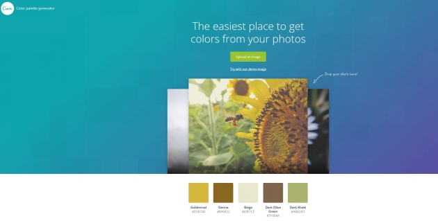
One of the easiest free color generator schemes that come from a great visual content creation tool. Canva’s Color palette generator works in a way where you upload a photo (or choose one of their own) and let the app show you five main colors and their Hex Codes. That simple, give it a try.
Material Design Palette
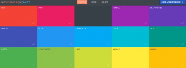
As you can see from the homepage, it’s obvious how things work here. Just pick any two colors and you’ll get a realtime example on the right side, alltogether with six more color combinations to pair it with. Moreover, each of those colors comes with the suggestion what to use it for so; it does some serious thinking for you, too.
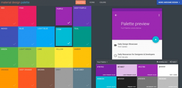
How great is that?
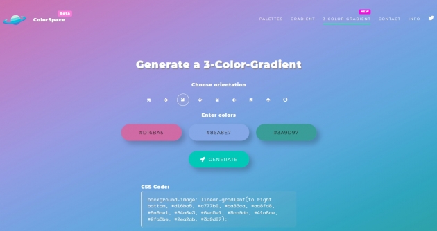
My Color Space
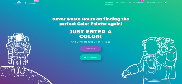
A high tech color scheme generator tool that creates a color palette based on one color aka Hex Code you type! Apart from that, you can use this tool to create a 3-color-gradient for your background image – just choose the colors, let the tool generate the gradient and copy and paste the CSS Code to your site:
Paletton
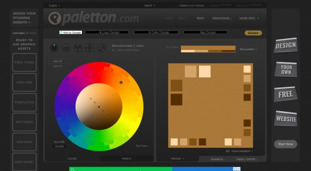
A tool that needs no introduction – if you come from e designer industry, that is. Paletton is a free tool you can use to create freestyle brand color palette or use many of the predefined features to create your perfect color scheme. In any case, you’ll see a real-time sample of your work on the right side of the screen.
Palettr
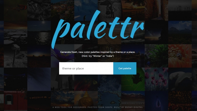
A slightly different color generator tool that uses specific keyword and images to define color palette. You just type a theme or place into the search box and let the app configure color palette out of many images that come from 500px. In that way, you’ll get a color palette and an optimized selection of images around that term you’ve searched. So, in a way, you’ll have a glimpse into what type of images you can use for your branding as well.
In conclusion
Hope you find this guide both educational and helpful. Feel free to share your thoughts and comments and if you’re in the lookout of a new theme, head to our Theme section to see if any of ours matches your color palette 🙂 In addition to this guide, here are more useful info on this topic. Go over to these links and improve your knowledge and find some inspiration: